WebMD understands that users have difficulty parsing through their massive collection of content. Users want a WebMD experience that does a better job of helping them find the specific information that’s most relevant to them, whether they are looking for themselves or for their loved ones. Competition in this space is increasing rapidly, and recent trends suggest that people are more and more turning to social media for medical information. WebMD not only needs to increase the number of users coming to the site to seek specific information, but also to entice them to linger on the site to explore other materials that are relevant to them. How would you suggest they increase user engagement and retention? Design a solution that is user-centric and could help how their site is used and perceived.
CASE STUDY
SKILLS USED
Competitor Analysis, Card Sorting, Sketching, User Flows, Site Mapping, Wire-framing, Prototyping, Usability Testing
TIME FRAME
2 weeks
research

Posted on September 30, 2012 by @AiDASiNC
Consider the human headache. If you plug in "headache" in the Mayo clinic you receive:
"Managing a tension headache is often a balance between fostering healthy habits, finding effective non drug treatments and using medication s appropriately."
By contrast, if you plug "headache" in WebMD you recieve:
There is a picture of a young lady holding her head in what appears to be pain. The headache "news," flashes on the right side of the page that includes scare headlines like "Headaches: When is it and emergency?" The first page contains no hard facts- you have to click and thereby drive up the sites lucrative click throughs. Finally arriving at, "Headache remedies include various types of pain relievers and often anti nausea drugs.

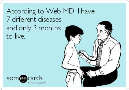
“WebMD always tells me I have cancer...or an STD.”
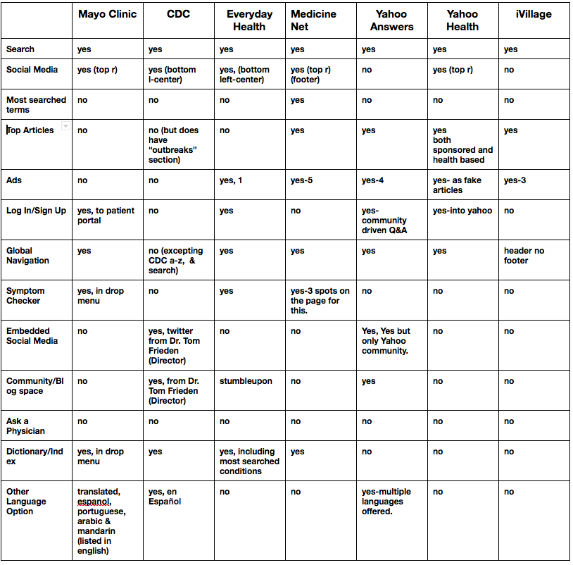
COMPETITIVE / COMPARATIVE ANALYSIS
the problem
The elephant in the room. Between the research and the survey conducted it appears WebMD loses a tremendous amount of credibility because their visitors are immediately inundated with advertising, and are uncomfortable by the sometimes frightening diagnosis the site can provide. The first generation of Web based health information tools emerged during the dot-com boom. Organizations like WebMD began to give patients more information than they ever had access to before. It allowed folks to take control of their health, in a way never before seen. However, after researching the origin of the WebMD, it was not created by medical professionals, and the way it has grown shows this.
After Heuristic evaluation, Web MD is like a dinosaur. Even beyond the look and feel, users just are not getting the information they want. Its one-way. The first critical component for any new online medical information product is to establish trust. After conducting user research and online survey it is clear WebMD has trust issues between the content it provides and the users looking for information.
WebMD has become known as a "Hypochondria time suck." With the site's connections to pharmaceutical and other companies, It appears, WebMD has become weighted down with pseudo-medicine. It frames information commercially, and with click bait style headlines. With every reason to amp up page views, impress advertisers and drive traffic to commercial sites, it has become an ad filled web site. Amid so called information about cancer and depression are banner ads for multiple drugs that have nothing to do with either.
Interviews
Lora and I conducted interviews & and simple user testing around navigational tasks (searching for thyroid cancer) to understand why users are searching for medical information on-line and feelings on WebMD.
A WebMD user that is Searching for reassurance: Interviewed a Self proclaimed Hypochondriac / patient/ caregiver. Identifies Anxiety as the root of the problem. source of anxiety regarding health concerns comes from TV/magazines, friends, personal experiences, and the internet.
"Now suddenly with a click of the mouse I am a nervous wreck."
"Simple rashes turn to lupus, because my father had it. Tired and thirsty, must mean I have diabetes, oh and a headache has got to be a tumor.
"When typing symptoms into the internet all rationality goes out the window. Google is my worst enemy, but it is addictive. I terrify myself with the worst pictures."
A concerned caregiver: They suggested changing the name of the site to improve confidence in it. They stated there are too many ads & popups and distracting information on the side. Recommended more information on topics such as - addiction, insurance, how to talk to patients about their illness, and most of all how to support patients.
"People are very savvy these days, making them perhaps overly suspicious of where info is coming from -is it being pushed by a pharmaceutical company?"
Health care Practitioner: We spoke with a Doctor about WebMD and asked about overall thoughts about the site in the medical community. Had concerns about the leading push toward rare diagnosis, and the anxiety it creates. It creates a great deal of self diagnosis and when a doctor appointment occurs it is nowhere near the actual diagnosis. This creates an odd dynamic where clients will say, "well the web tells me different." Stated when they recommend a client search for information online they actually point the client to Wikipedia.
Proactive patient: Does not access health sites often. Primary uses the web to be more informed on own healthcare. To be knowledgable about what kind of discussions to have with the doctor about treatment. Prefers patient communities-"patients like me, they feel more trusted.”
Empathy Maps & Personas

Based on the interviews, and the survey we posted on Slack and Craigslist about healthcare decisions, we moved forward with empathy maps to flesh out personas.

the solution
Lean UX focuses on research and the minimum viable product. Getting your product in front of customers early in the process lets you test any hypotheses you have about both the product and your customer base. Uncovering misconceptions up front allows you to iterate and pivot to arrive not just at the best design, but the right one.
MVP for WebMD: A website that provides relevant medical information that users have confidence in. Better information, Better health. What you’ll get is: No hysteria. No drug peddling. Good medicine. Good ideas. simple.
WebMD has a user base so it is not about getting the product up for users to use it is about retaining the users. Keep changes small & slow to retain the base that is already familiar.
Smarter drug advertising. Link pharmaceutical advertising to the symptoms and illness they are directly targeting. Good medicine and good ideas.
Gain the trust back, need to think bigger for the next wave of change in the medical field. Like personal health apps, Personal health monitoring (fit bit etc. ), Doctor email communication, face to face communication with medical professionals online to review health monitoring tools.
Target users: Patients, Concerned Family Members, Health Care Practitioners, & Healthy People.
Create a landing page focused on Healthy care not sick care. Focus on preventive medicine and healthy living to ease people into being proactive about their health and in doing so ease anxiety.
Long-Term
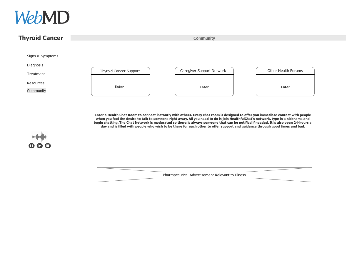
Strengthen the WebMD Support chat rooms. Make is a stronger community to better support the individuals seeking out health information and resources.
Create Patient & Health Care Practitioner Portals, get answers from an expert.
Integrating Health Trackers into a personalized database, that can be shared with physicians.
card sorting
We conducted card sorting to work out the header layout menu.

FLOW CHART


WIREFRAMING
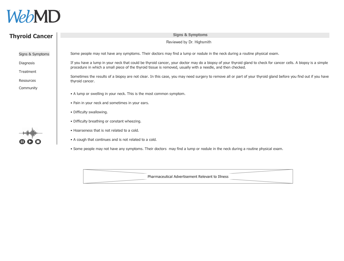
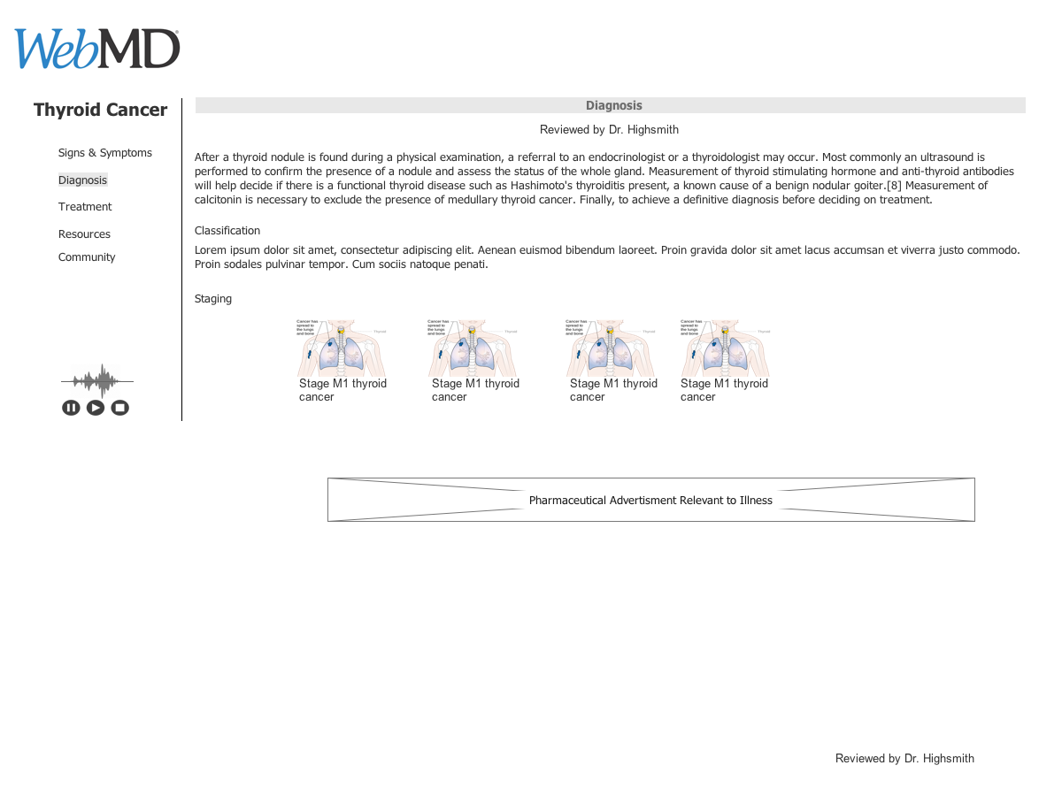
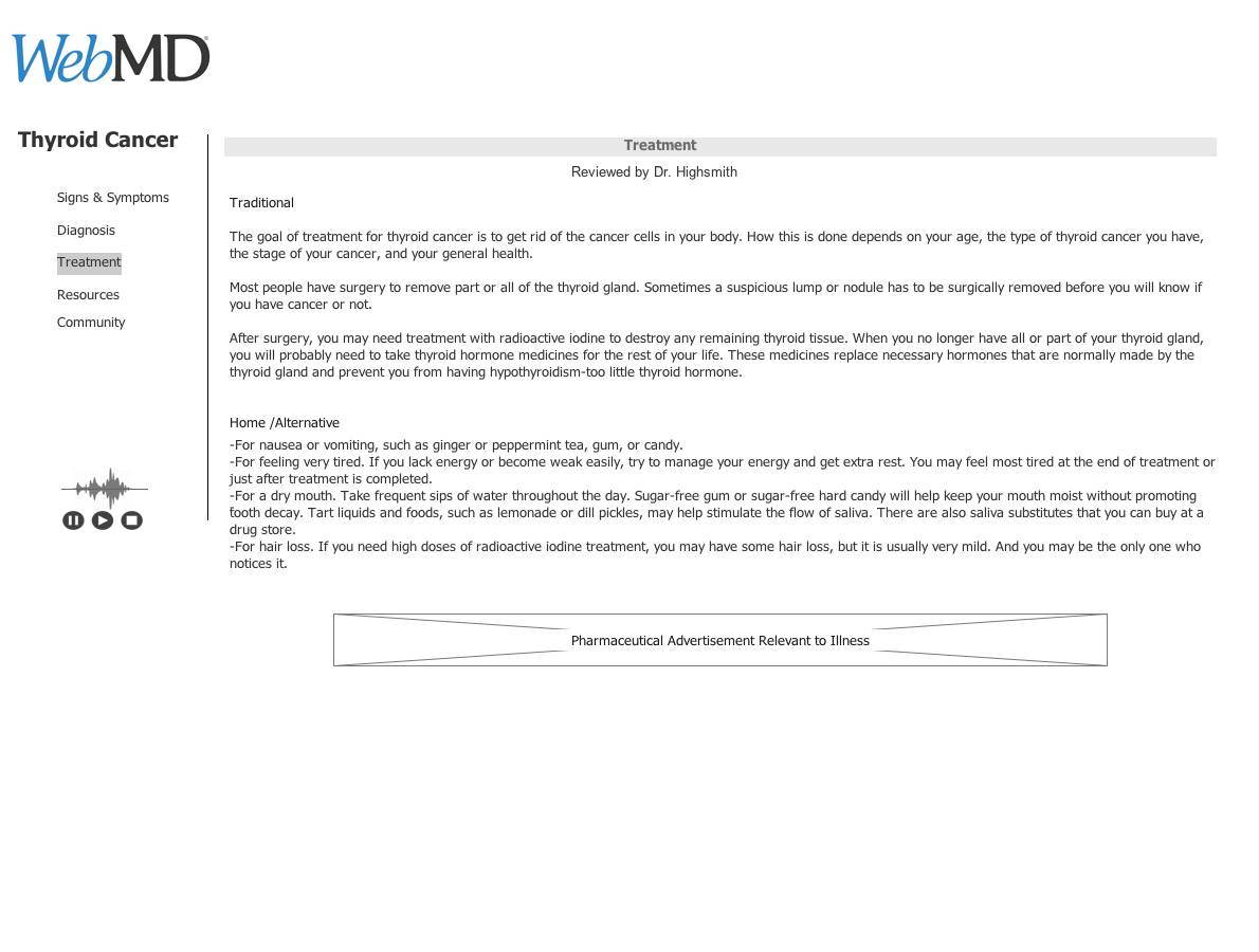
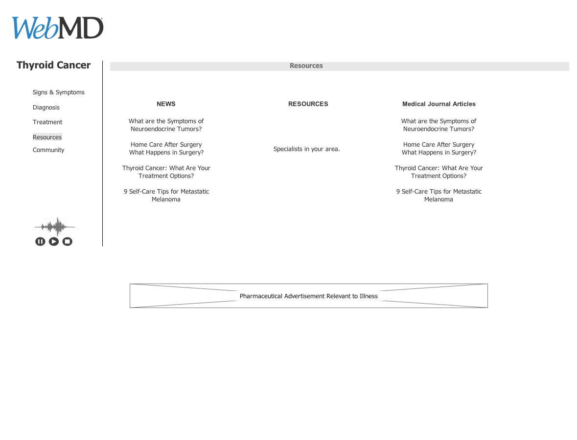
Three layouts for an illness page were created in an attempt to find signs & symptoms, diagnosis, treatment, resources, and community (online support and forums). We user tested each of these to see which worked best for users to obtain basic information on thyroid cancer.
Option #1
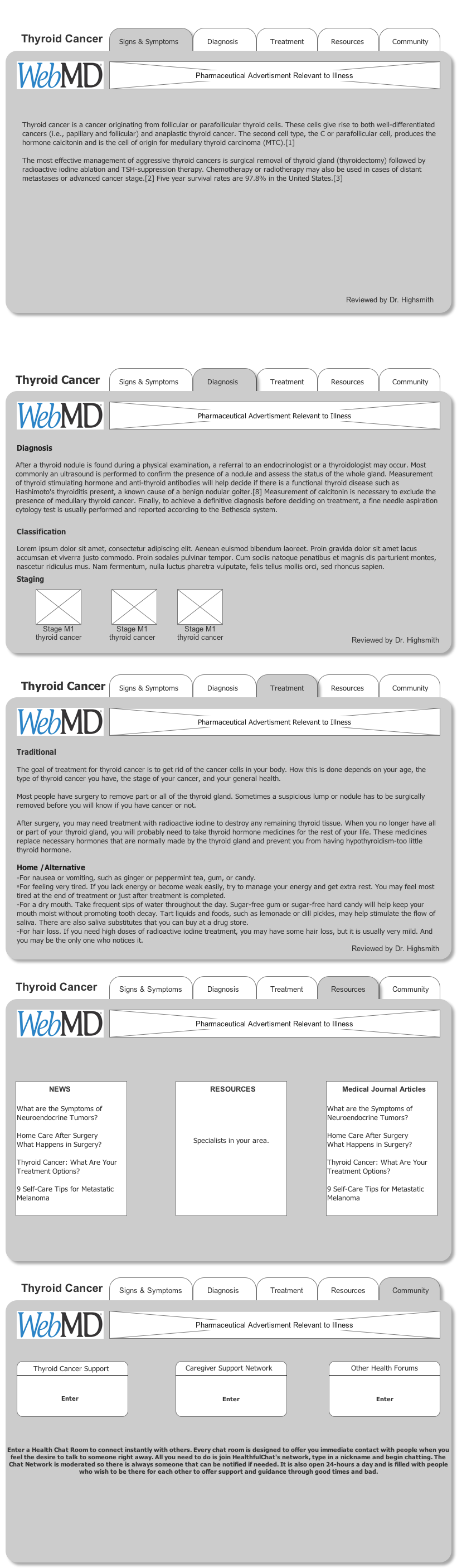
Option #2

Option #3

Option #3 was chosen over the other options by users tested. This was then fleshed out a bit more to round it out and hit all the topics that users testing showed would be the most important to them when researching a topic.