True spirit: e-commerce site
CASE STUDY
SKILLS USED
Research, Competitor Analysis, Card Sorting, Sketching, UserFlows, Site mapping, Wire framing, Prototyping, Usability Testing
TIMEFRAME
2 Weeks
THE CLIENT
Project for User Experience Design Immersive at General Assembly
MY ROLE
The Sole UX Designer: I was provided with a brief, 3 personas, and inventory list. My job was to draw out user, brand and business goals, structure the content, design key screens of the site and create a clickable prototype.
TOOLS USED
Pencil & Paper, Google docs, Axure
THE BRIEF
True Spirit is a school uniform company ranging from Grammar to high school. They offer updated uniform fashion including pants for girls and zip-up hoodies, provides a "must-haves" checklist from he school's administrator for each school year, and recommends accessories allowed by the school's dress code. Unlike traditional school uniform suppliers, True Spirit encourages visitors to express their tastes-with some limits.
THE PROBLEM
Design a desktop e-commerce experience for parents so that they feel they are making the right uniform selection for their children. True Spirit also wants to convey that they are all about great service, quality products, and fostering community.
THE CHALLENGES
Dress codes can be very specific, and vary widely by school. The challenge was in finding a way to make it easy for parents to find their school and select the right items for their student without too much effort on their part and without overwhelming them with information.
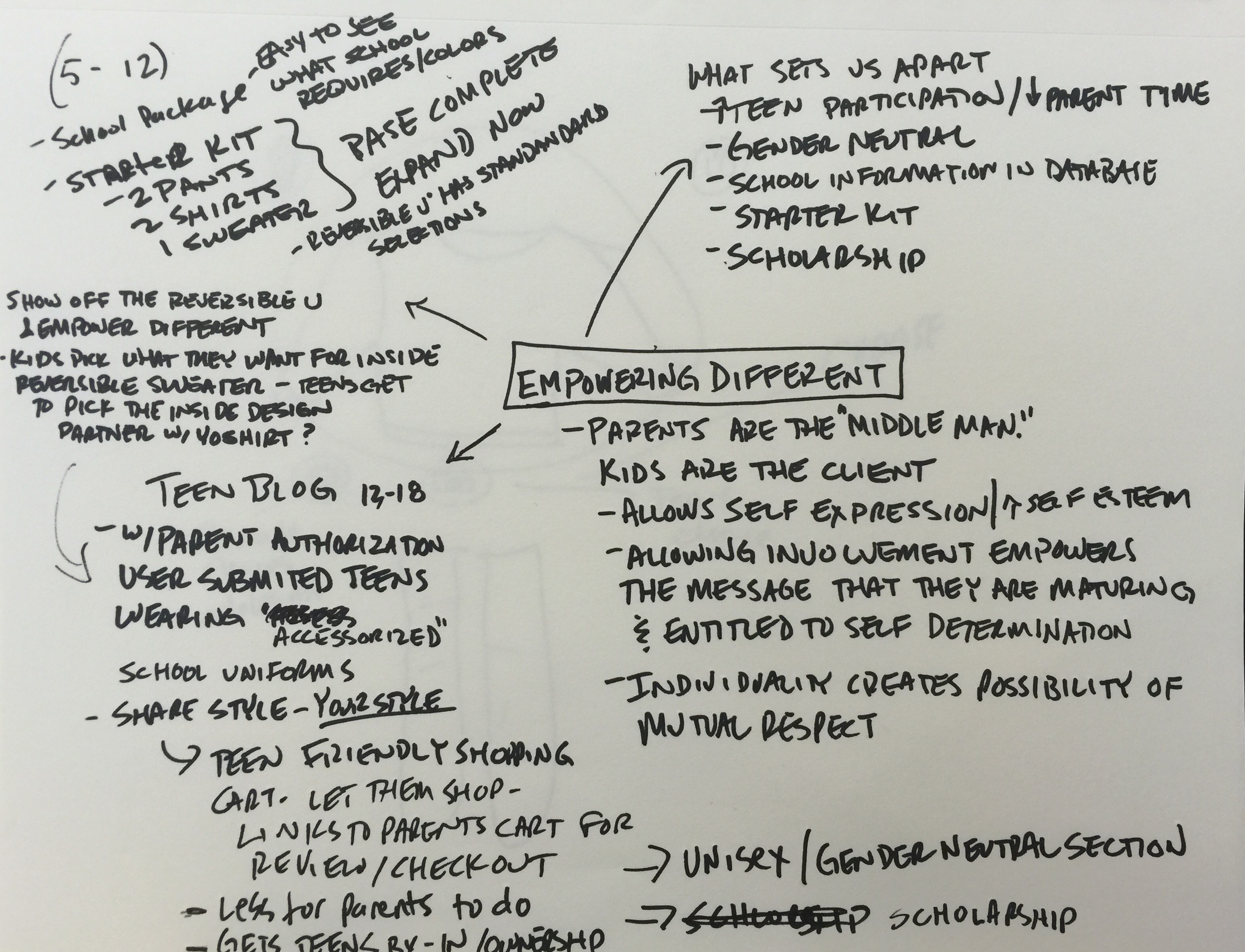
I also thought it was important to not forget the the actual child wearing the clothing. It is important because self expression increases self esteem. Need to increase user by-in to show how True Spirit is different.
Creating an intuitive and quick checkout flow
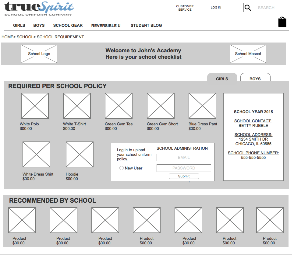
Give parents ability to access their school uniform page and provide an essentials checklist
Create the ability for guest logins
Give children ownership of their look if possible.
Provide an experience similar to in-store service
the Solution
I designed a site that allows busy parents to navigate straight to a page with their child's school uniform selections, see what is in the schools essentials list, and quickly proceed through the checkout process. Turning what can be a stressful task into a process that is quick and simple. I also wanted to get long term buy in from the people the wear the clothing, the kids. To do this researched how kids modify school uniforms to create their own look and express themselves. I created a reversible school sweater called Reversible-U to empower difference and provide ownership of the the clothing by the kids wearing it. So they want True spirt more then competitors.
The research process
UNDERSTAND THE BUSINESS
I placed True Spirit within a marketplace business model, but with aspects of community that they would like to convey. I then decided on the success metrics I would like to work towards.
Success metrics:
Returning customers
Avoiding cart abandonment
Keeping uniform item returns low
COMPETITOR ANALYSIS
The competitor analysis involved both school uniform sites and other fashion e-commerce sites. This helped with realising what industry standards to include in the site. I also decided to analyse online companies with strong customer service and a great checkout system as this is what True Spirit wanted to convey as well.
e-commerce competitors: Target, Lands End, Banana Republic, Gap.
Service competitor: TrueGrits
Non-direct competitor checkout flows: Amazon
Take Away:
Great service for customers includes easy returns, ease of contact when problems arise, and informative FAQ sections.
Sizing of uniforms should be consistent and stock availability should be clear.
Pickup locations are not offered widely.
No modern looking or appealing sites dedicated solely to school uniforms.
Noted users of the "uniform" were being underserved.
CARD SORTING & SITE MAPPING
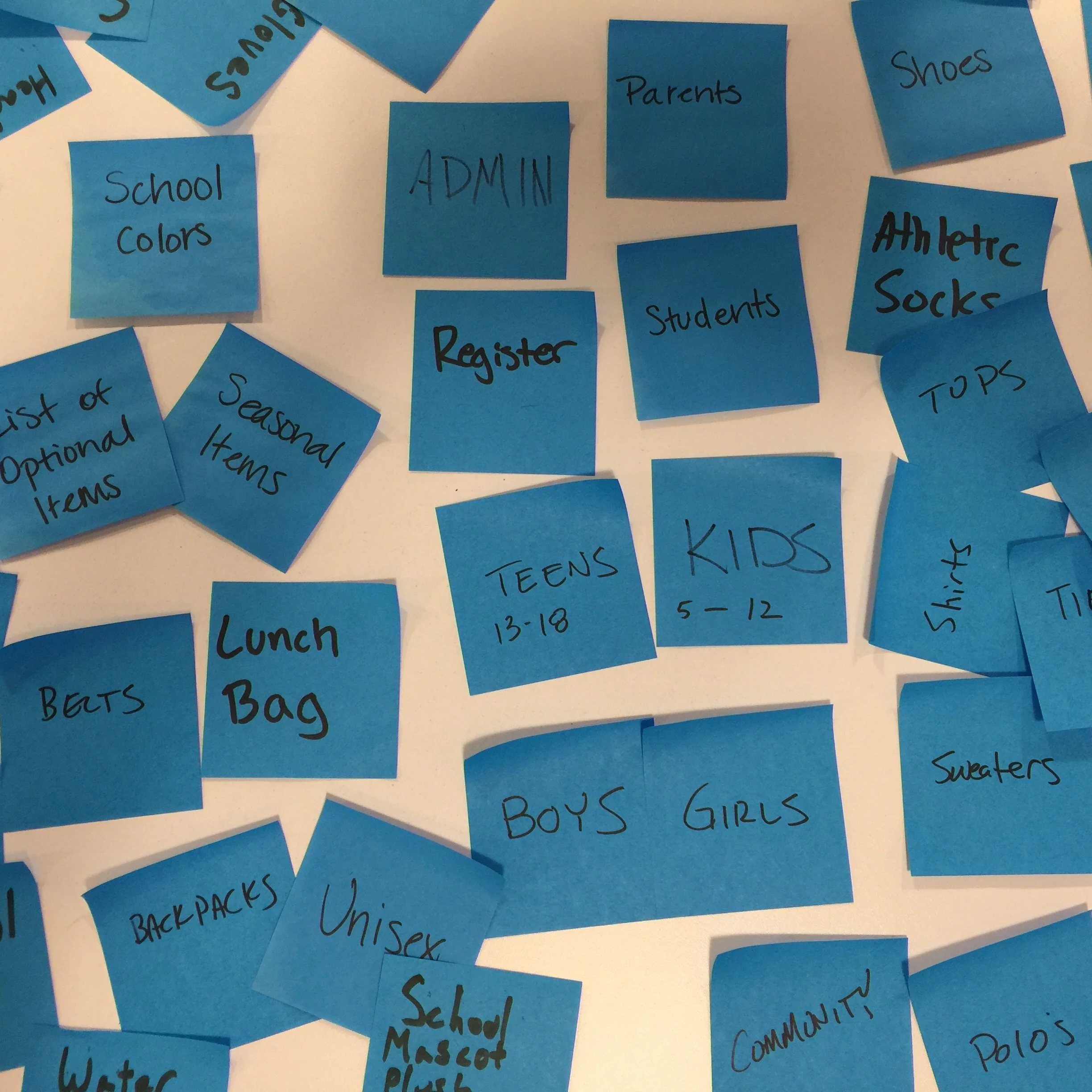
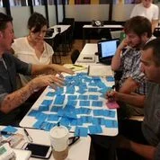
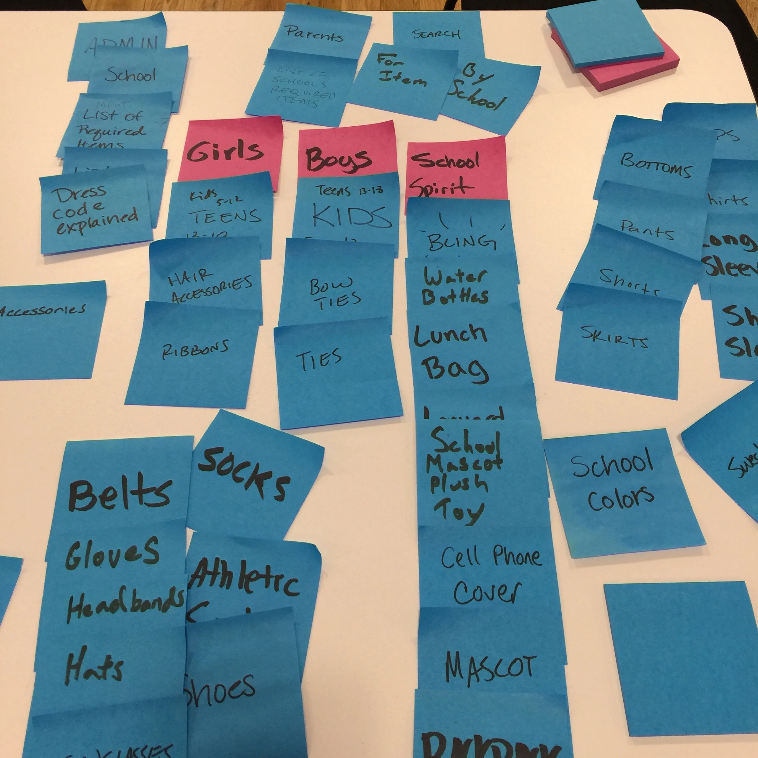
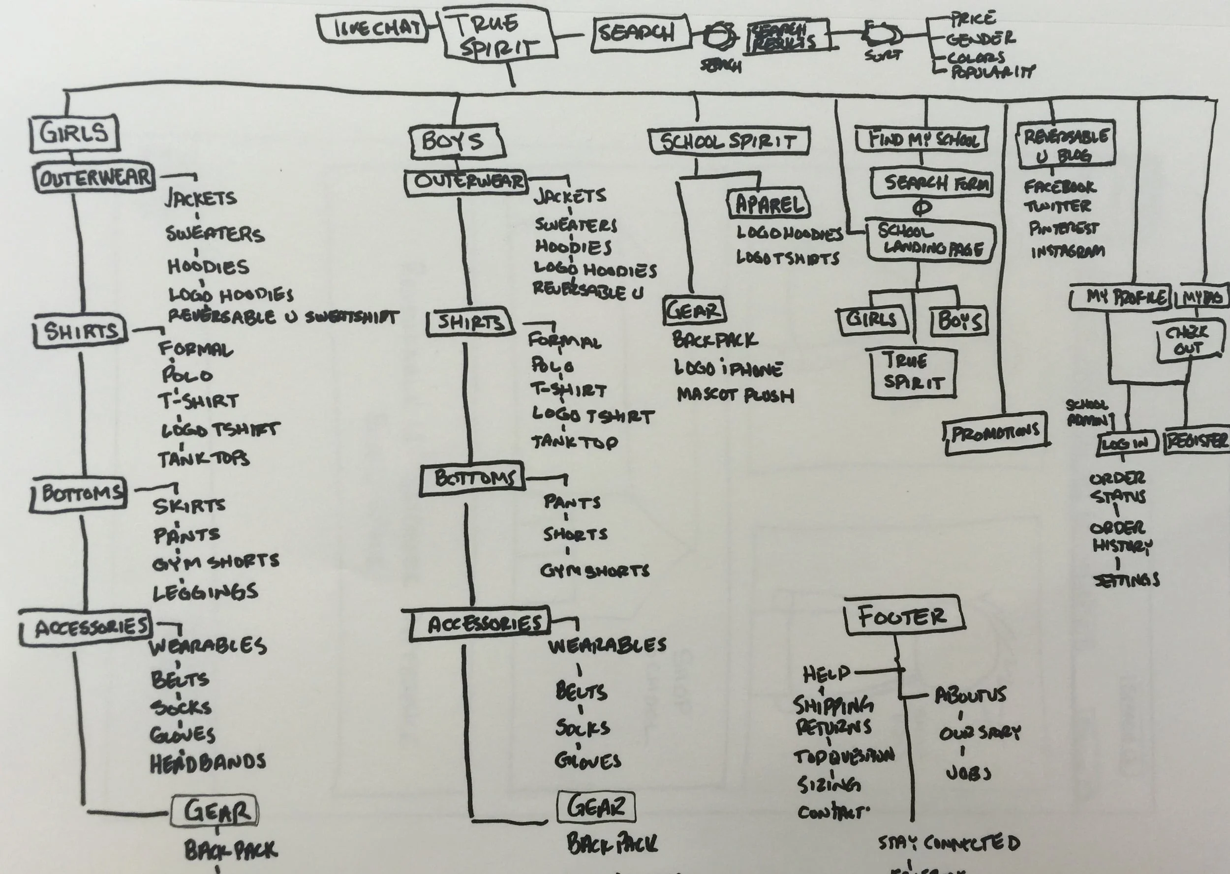
I worked with other classmates to organize the uniform products into easy to locate categories and subcategories and also used my competitor research to inform my site navigation structure. My classmates and I all had the same assignment, and we worked in teams of two to card sort the inventory list we'd been given. Everything was going smoothly till we got to the unisex items like accessories and school-branded shirts. Ultimately I divided inventory into just 3 overall categories: Girls, Boys and School Spirit.
I then used card sorting results to create a hierarchical sitemap which would provide an intuitive way for users to navigate between pages.
Take away problems to solve:
Understanding how people categorise elements of uniforms
Understanding what pieces of data should be top level information
Creating labels for users ease of understanding
From the card sort I was able to come up with a system of laying out the merchandise and flow on the site for school admin, folks shopping strictly for school must haves, and those shopping just to shop.
THE PERSONA
I was provided with 3 personas – 2 parents, and a school administrator. Efficiency and simplicity were big with everyone.
Parents want assurance they’re getting the right items and right fits for their students, and school administrators wanted to give parents choice, but keep the whole process simple on the admin and parent side.
I collated a quick list of each of the personas goals and then using the “5 why’s technique” I distilled these goals into an overarching theme for each persona.
Jess- looking for vendors to meet parents demands for uniforms. Looking for wide range or price and quality.
John- pragmatic purchaser-wants quick and easy - knows what he wants and wants minimum hassle.
Sarah-Savvy spender-wants personable and good service similar to in-store experience - confidence in the product and site.
Both want ease of returns.
“I want to have enough information so that I know I’m buying the right thing”
Take away:
I highlighted the most critical aspects that would identify the problems our users had in common and made solutions to those pain points ("being sure of what i'm ordering") the pillars of my design (customized school shopping checklist).
I also realized the major target audience was missed by not including at least one student in a persona. Students are the foundation of theTrue Spirit brand, and we want students to identify with the True Spirit brand. Their buy-in will help lead parents and caregivers to the True Spirit brand. So I created an additional persona for Janet- a student.
Research
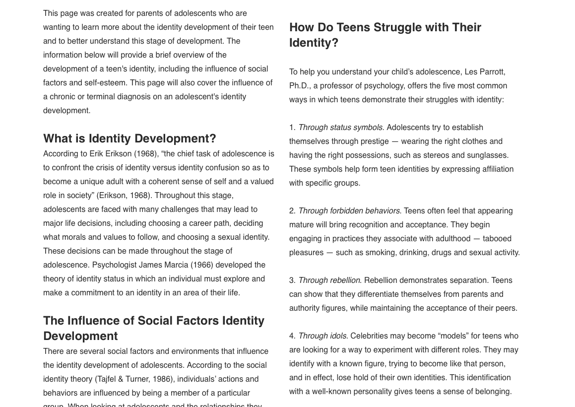
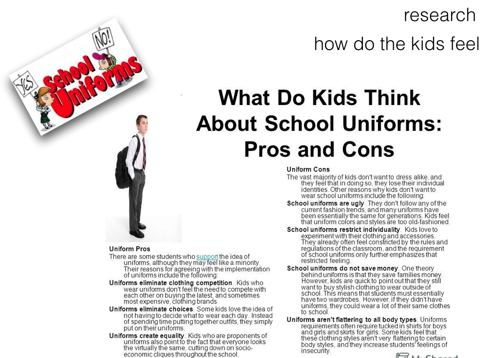
Since students are the ones wearing these uniforms they are the true user of the True Spirit Brand. I wanted to know what they thought of Uniforms, how they might take "ownership," of a standard school uniform by adding accessories to express themselves and their individuality. Adolescent students are going through gender identity issues as well as struggles with their identity.
Take away:
Teens post to social media to gain approval prior to most purchases.
Kids need to be allowed to express themselves to increase their self-esteem.
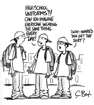
Kids do not mind uniforms, but are constantly looking for ways to stand out. Accessories, etc.
Schools quickly put bans on any sort of self expression with accessories. Even socks.
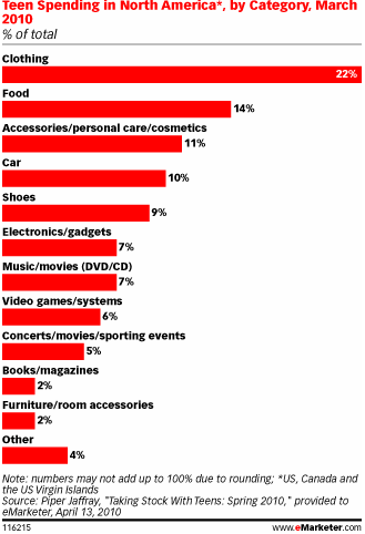
Kids spend a great deal of $ on appeal. Use Debit. Browse in stores, purchase online.
USER FLOWS
Finding separate overarching goals for John and Sarah it was a lot easier to design the uniform buying journey for each user. John only needed a quick process while Sarah required more guidance with the uniform choice and care. Breaking down each task into actions and the thought process behind each action also helped with determining the “happy path” of John and Sarah.
Take Away:
I struggled to make the user journey as short as possible. In most cases, the user can reach their goal in three clicks or less. Streamlined by use of autofill and smart search suggestions.
CHECKOUT USERFLOW
After analysing competitor checkout flows I knew I wanted to keep mine as simple as possible, but still with the options that users expect if they are purchasing in-store. An example of this is deciding to change a color of an item while at the checkout in-store which would translate to being able to edit an item in an e-commerce checkout.
CHECKOUT IDEATION PROCESS
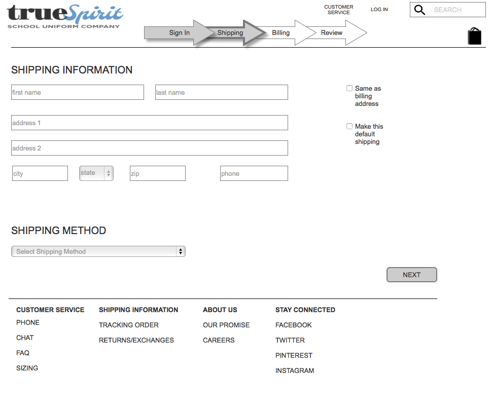
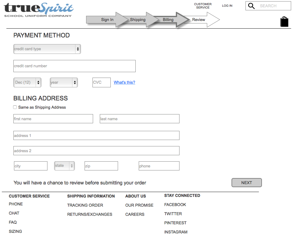
The checkout process was one of the most important parts of the e-commerce site. Cart abandonment was a success metric I had decided upon at the start so the checkout flow had to be done correctly.From the competitor analysis, research, and the checkout userflow I knew that I needed the following features:
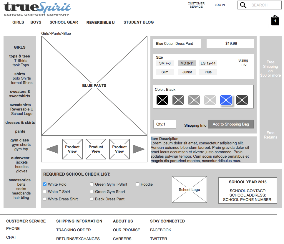
Guest login for quick purchasing.
Option to deliver or pick up items.
Information about returns, delivery, FAQ’s, and contact details to displayed on each screen in the flow.
A mini basket of items on each screen.
The ability to edit basket items, delivery details, and payment information on the review screen.
The ability to continue shopping at the review screen.
wireframes
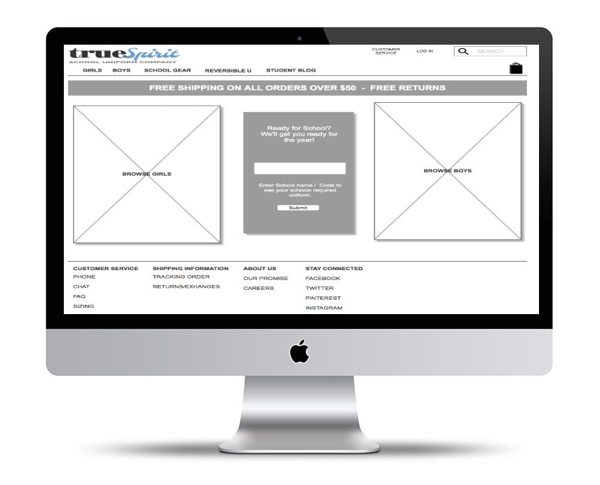
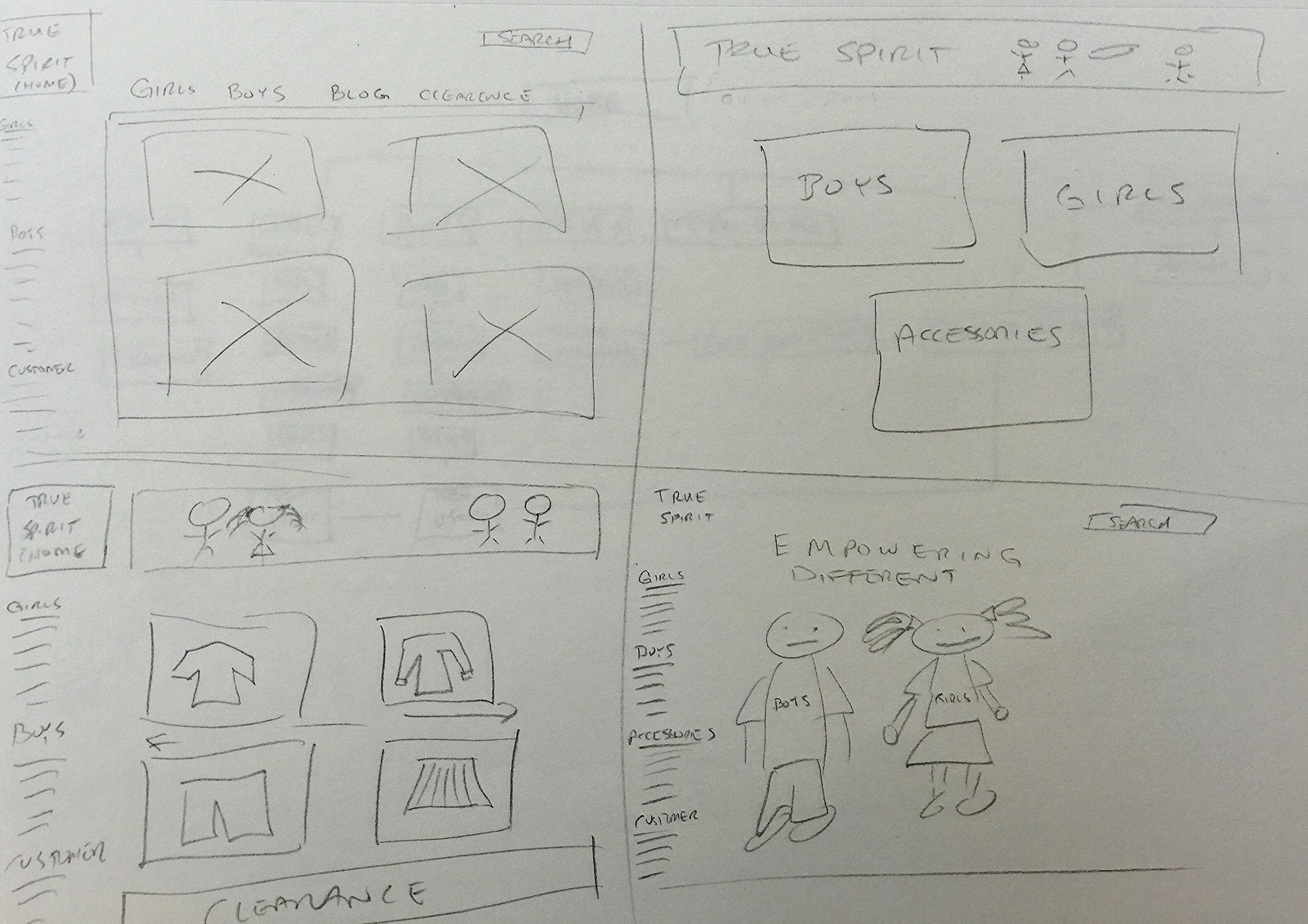
As with the checkout flow I analysed the research data and sketched some very low-fidelity wireframes of features and elements on the home, category, and product pages to meet the user journeys for John and Sarah.
I was then ready to create the newly iterated checkout sketches as digital wireframes in Axure and get ready for usability testing.
SHOPPING FLOW WIREFRAMES
CHECKOUT PROCESS WIREFRAMES
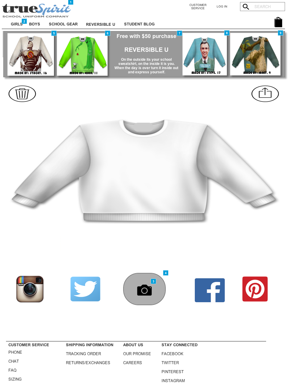
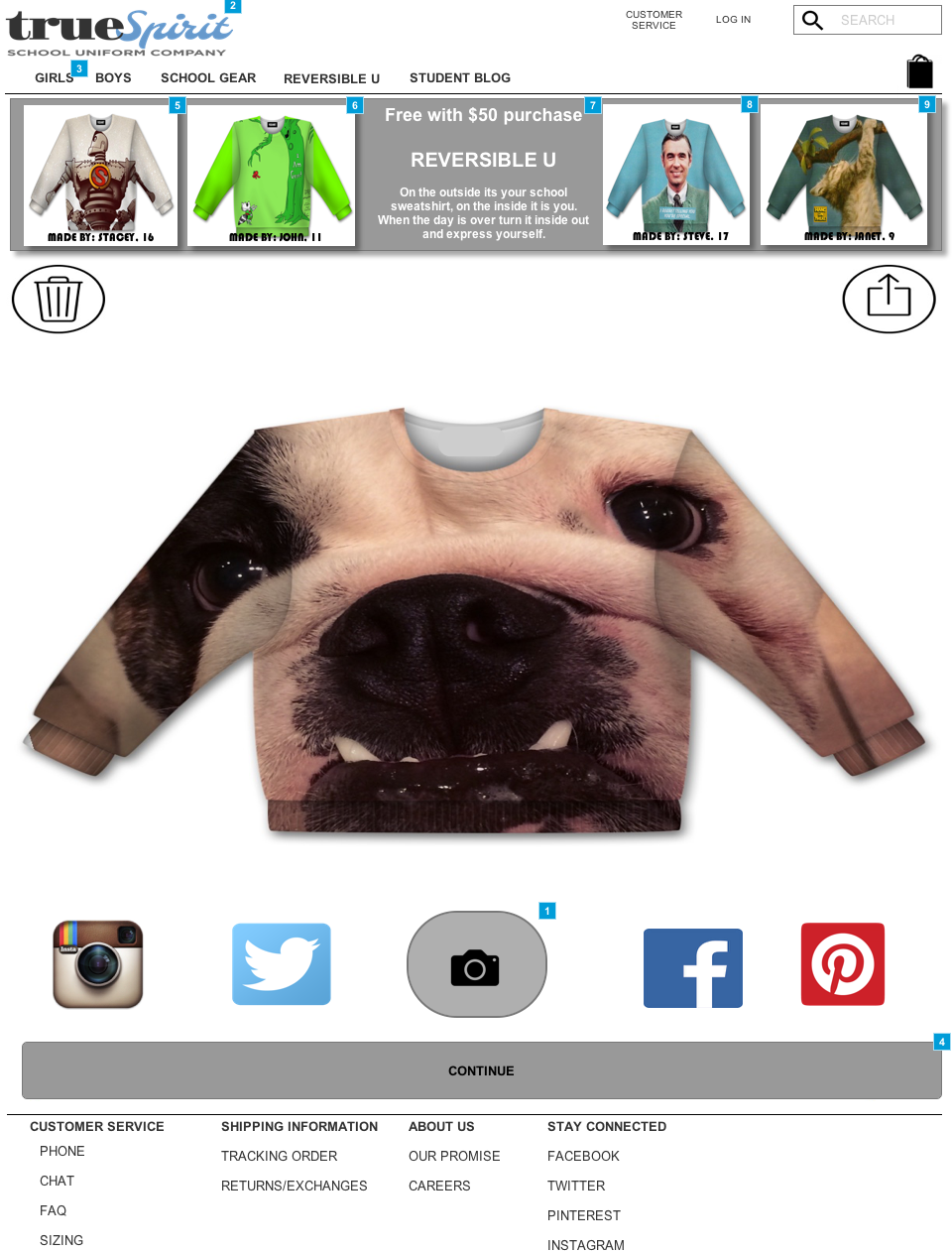
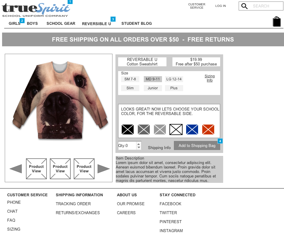
REVERSIBLE U
“On the outside its your school sweatshirt on the inside its you. When the day is over turn it inside out and express yourself. ”
I found the most enjoyable part of this project was playing around with how to make True Spirit stand out from its competitors. I wanted to create something that showed True spirit cared about the individuality of the kids who have to wear uniforms, and in doing so it makes itself different. The goal was to get students to want True spirit and guide their caregivers to this brand instead of the others.
The idea is School uniform wearing kids can upload an image that means something to them. This image is printed on the inside of a reversible sweatshirt. On one side is the school color and log and on the other is the image picked by the student. They can then blog about it on True spirit teen blog, share it to other social networks and even post a parent approved pic of them wearing their created design.
Usability testing
TESTING & ITERATION
I conducted a usability testing session with four users over the course of a day to find any problems and observe user behaviours when using the wireframed site. After these tests were concluded I worked out which changes (due to time constraints) I would be able to make in the next iteration of the prototype.
The testing consisted of asking users to complete simple tasks:
1. Locate school required uniform.
2. Find a female white polo shirt.
3. Find female blue pants.
4. Purchase an item.
Take away:
High fidelity and low fidelity do not play well together.
Need to focus on user experience design and not on Visual design until foundation has been placed.
Folks noted visual issues first rather than function. This created problems.
First changes created a lot more changes and ended up getting more complicated before getting simple.
Keep It Simple Stupid. To much creates a more difficult user flow.

